Often times a larger project’s Gantt chart gets “busy” and hard to read. All the summary bars are black. Everything looks the same. For a small project it’s not so bad but for larger projects it gets difficult to pick out what part of the schedule is being looked at. One simple way to improve the readability is to colorize the gantt chart summary bars based on some criteria, e.g., left-most WBS number.
So, exactly how do we do this? Easy!
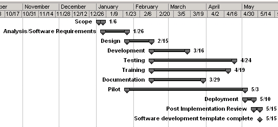
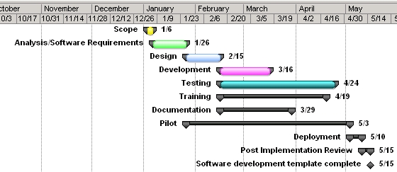
I’ve created a MS Project 2007 project schedule from a software development template supplied by Microsoft. Here’s a link to the project file before we customize the gantt chart with color.

I’ve formatted the gantt chart as I prefer to show the Name field to the left of each bar and the finish date to the right.
Now to add color to the summary bars. What I’m going to do is assign a different color to all summary tasks based on their WBS number. The two primary steps are:
- Define new bar styles, applied when a Flag field value is true.
- Define a formula to set the flag value based on the WBS number.
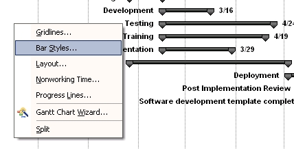
First, right-click in the Gantt Chart and select “Bar styles…”
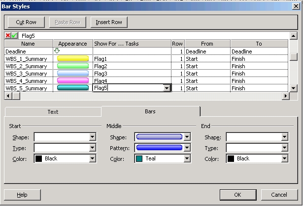
Scroll down to the first unused line. Here is where we add new bar styles. Add a new style by giving it a name, a unique format (color, pattern, shape, etc.), and specifying when it’ll be used. For example, the “WBS_1_Summary” style will be used whenever the field Flag1 is true. I’ve added several styles and given them rather obvious names. Also, the Flag field I’m using for each corresponds to the WBS left-most value, e.g., Flag4 for WBS 4.anything.
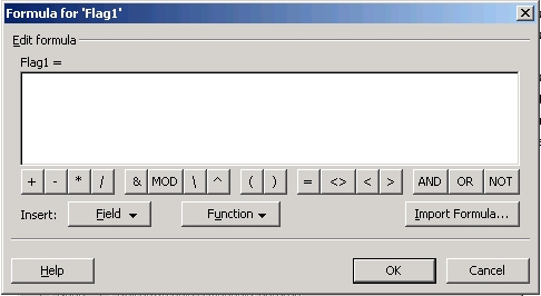
Now that the bar styles are defined, we need to modify the Flag fields to have their values (True/False) for each task in the schedule calculated based on the task’s left-most WBS number. From the Project menu bar select “Tools” -> “Customize…” -> “Fields…”, and the Custom Fields dialog will be displayed.
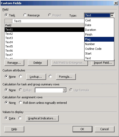
At the top right select “Flag” from the drop-down (the default is “Text”). In the “Custom attributes” section in the middle of the dialog box select the “Formula” radio button. When you do this Project will display warning you that you’ll lose all the existing values for the field. This is OK, since we’re going to set the Flag using a formula. Next, click the “Formula…” button and the formula entry dialog will display.
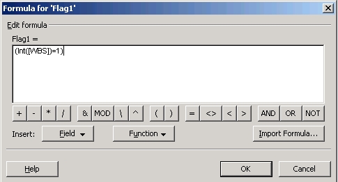
Since we’re editing Flag1 we need to have it set to true if the WBS number starts with 1, so we write the formula as you can see here to accomplish this.
By the way, this will color everything and not just summary bars. To only color summary bars just change
(Int([WBS]=1)
to
(Int([WBS]=1 and [SUMMARY])
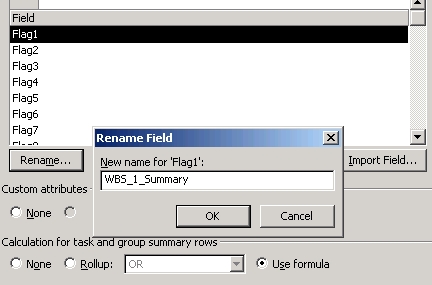
Note again that when you save the formula you’ll get another “Existing data in the Flag1 field will be deleted….” warning dialog. Again, this is OK. Next, in the “Calculation for task and group summary rows” section click the “Use formula” radio button. Finally, and you don’t need to do this but I do to keep things clear, rename Flag1 to something that makes it’s use obvious. Click on the “Rename…” button and enter a new name. I renamed Flag1 to “WBS_1_Summary” as you can see here.
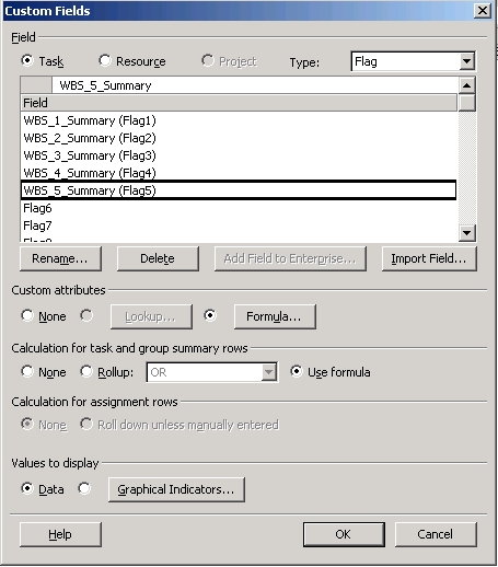
I’ve customized fields Flag1 through Flag5 the same way,
and here is what the Gantt chart now looks like:
If I expand the Gantt view to show more outline levels all the summary bars for WBS 1.anything will be colored yellow. Remember that you can go back to the bar styles dialog (right-click in the Gantt view and select “Bar styles…”) to change the color to whatever you wish.